The moment your mail piece lands in someone’s hands, you have precisely three seconds to make an impact. Understanding how to make those seconds count through effective graphic design can dramatically improve your direct mail results. The science behind successful postcard mailers reveals fascinating insights about human behavior and response triggers.
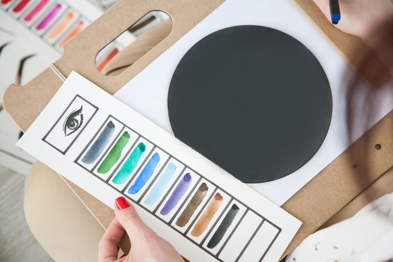
Color plays a crucial role in recipient engagement. Research shows that color usage can increase readership by up to 40%. However, it’s not just about using more color – it’s about using the right colors in the right places. Strategic use of color can guide the reader’s eye and emphasize key messages.
Typography choices significantly impact readability and response rates. While decorative fonts might seem appealing, clean, readable typefaces typically perform better. Your message needs to be easily digestible at a glance, and proper typography plays a crucial role in achieving this goal.
White space, often overlooked, is actually one of your most powerful design tools. Proper use of white space can increase comprehension by up to 20%. It gives your message room to breathe and helps important elements stand out. The most effective designs often use less content than you might expect.
Consider how different design elements work together to create an immediate impression. Size, shape, and texture all contribute to the recipient’s initial response. Understanding these elements helps you create pieces that demand attention and encourage engagement.